Space Management
Overview
The Space Dashboard is the core tool for building visualized business views in IoT. It allows project administrators to flexibly organize devices and data based on physical spatial structures (such as floors, areas, functional zones), and build monitoring dashboards for different business scenarios through rich visual components, thereby achieving device status transparency, operational data visualization, and refined business management.
Access Method and Prerequisites
How to access
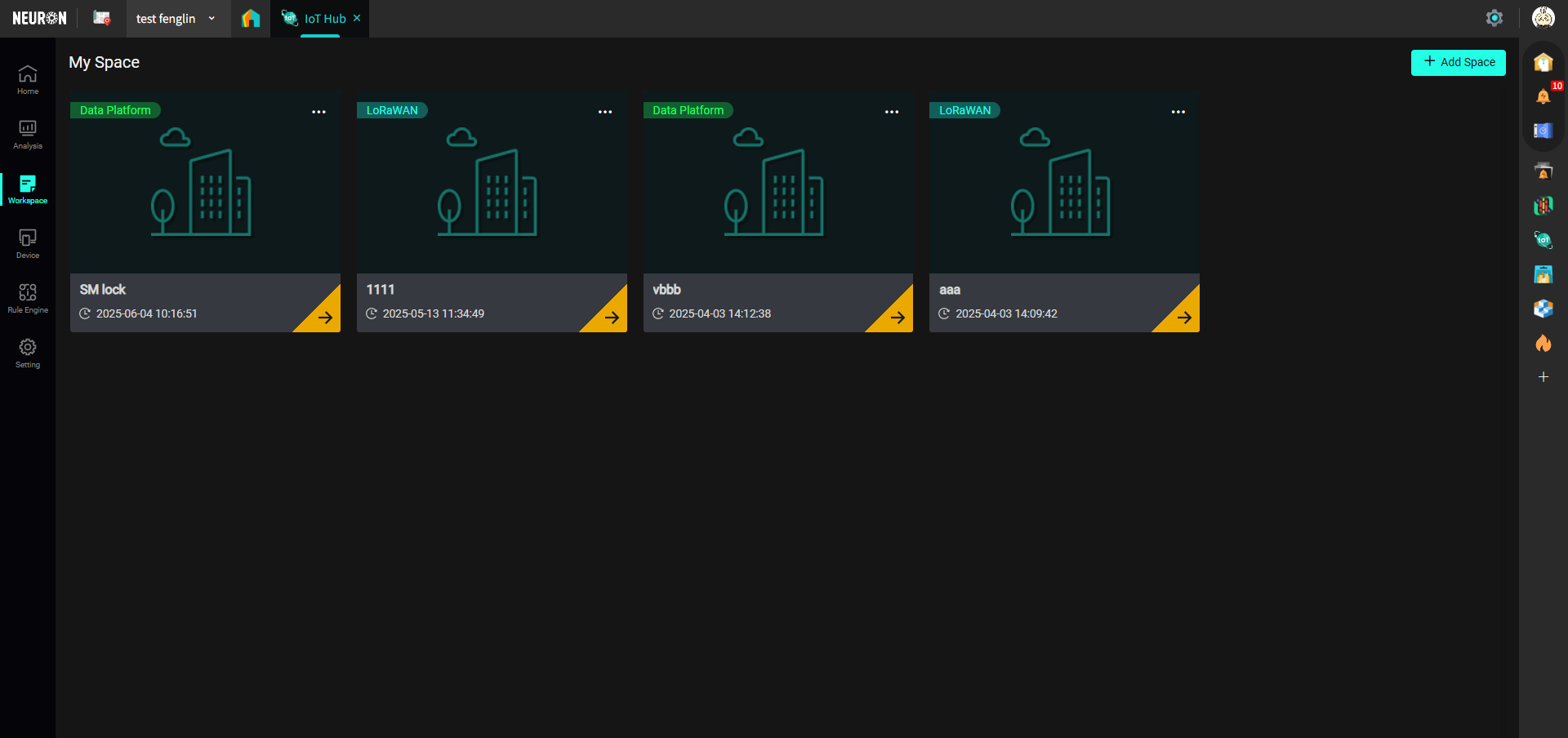
Click the "Workspace" button in the left menu bar to enter the workspace interface:
Before You Start
Permission Configuration
To ensure normal use, your account needs Project Administrator permissions to add/edit/delete/publish spaces.
Create Space
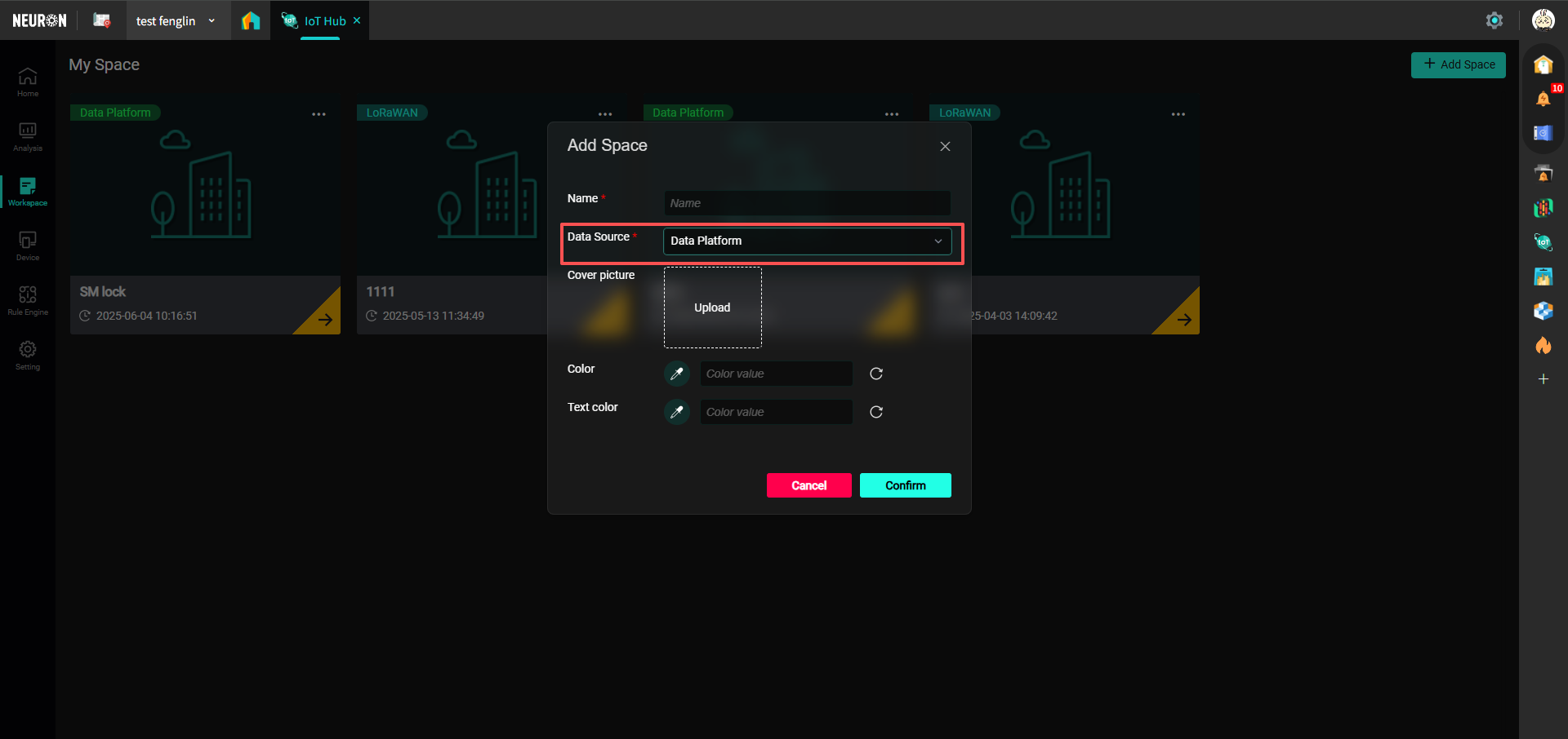
You can select an existing workspace or click "Add Space" to create a new workspace, as shown below:

You can choose the data source, which includes:
1. LoRaWAN indicates data comes from manually bound devices in IoT;
2. Data Platform indicates data comes from the Data Platform.
If using devices connected to the Neuron Data Platform, then the Data Source should be selected as Data Platform when creating a space.
Dashboard Pages
After selecting an existing workspace or creating a new one, you will enter the dashboard page of the workspace, as shown below:
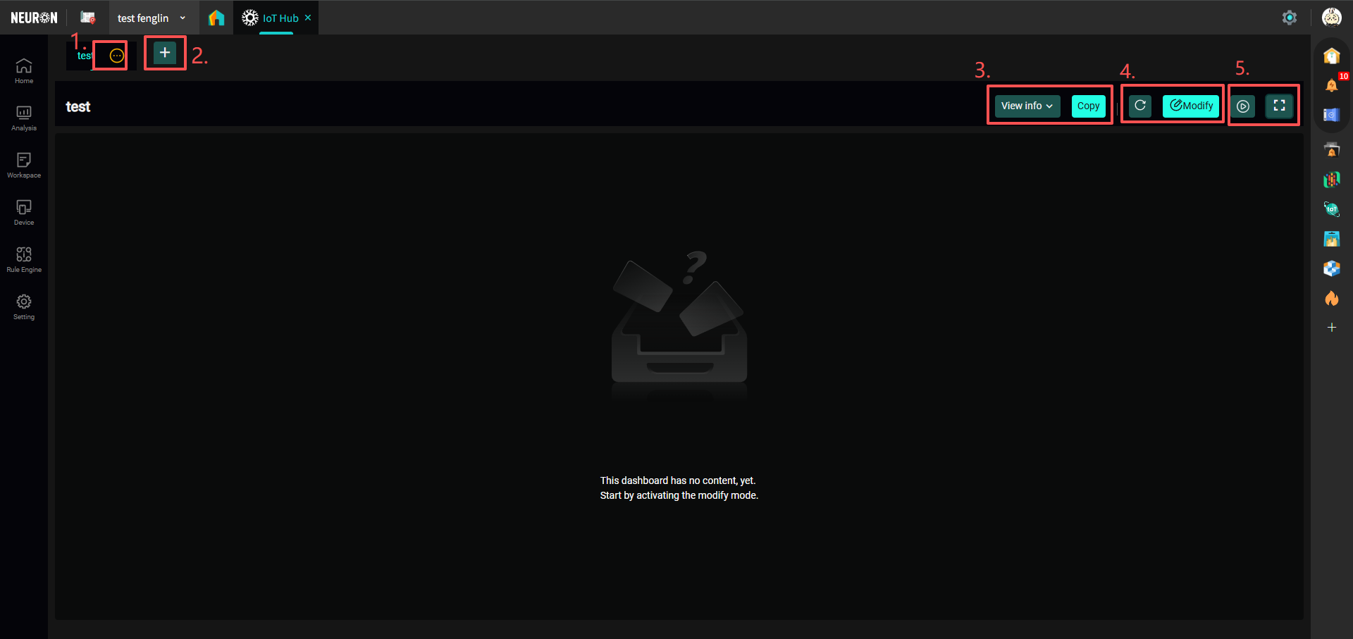
- Click the edit button next to the dashboard title to edit the dashboard name, publish the dashboard, delete, and share the dashboard;

- Unpublished dashboards are only visible to administrators. To make them visible to all personnel within the project, the dashboard needs to be published.
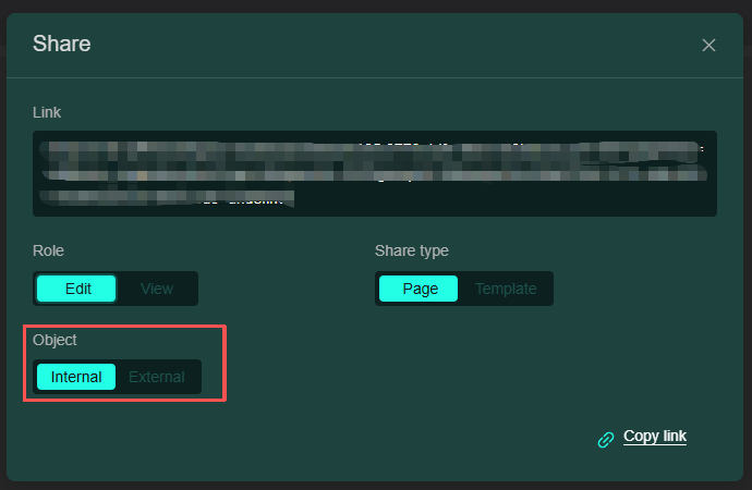
- When using the share dashboard function, you can choose to share the current page or the template, and assign permissions (e.g., editable or view only). Also note the following:
- If sharing only within the platform, select Internal in the "Object" field, as shown below:
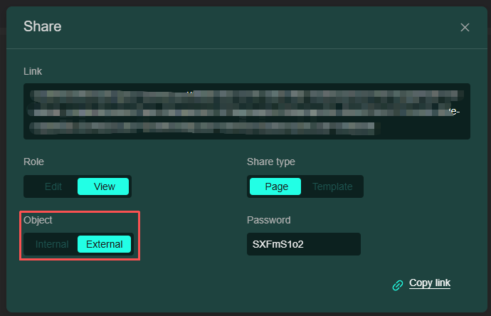
- If sharing to external platforms, select External in the "Object" field, as shown below:
- If sharing only within the platform, select Internal in the "Object" field, as shown below:
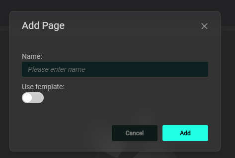
- Click "+" to add a dashboard page, and you can choose whether to use a template;
Note: For detailed template operations, please proceed to the Dashboard Templates section below.
-
Click "View Info" to expand the dashboard details; click "Copy" to copy the dashboard to another dashboard;
-
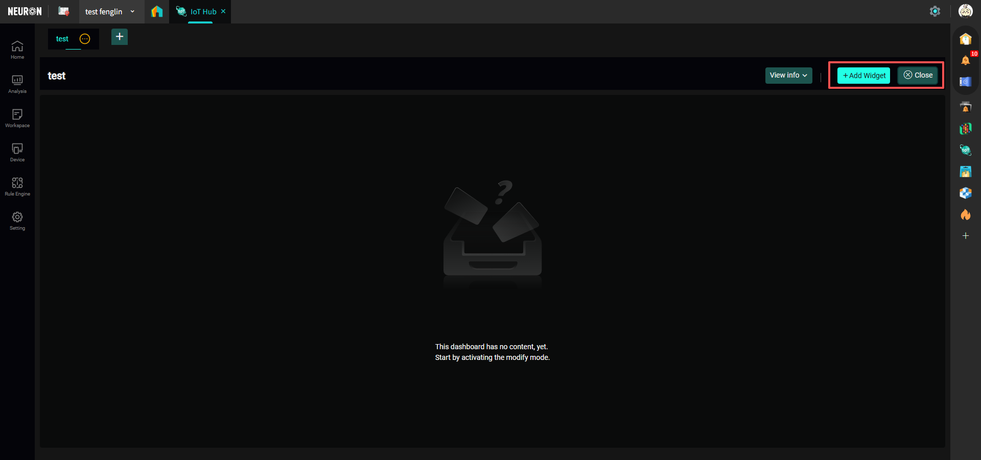
Click "Refresh" to refresh the current dashboard's data; click "Modify" to enter the dashboard editing mode, as shown below:
 The left side is for adding card functions, the right side is for exiting edit mode; Card Functions are explained in detail below, you can proceed to view.
- Click the left button to cycle through all dashboards within the current workspace, the cycling speed is about 20s; click the right button to fullscreen the current dashboard.
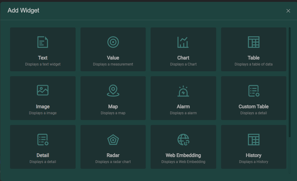
Card Functions Detailed
The module provides 16 types of custom function cards (including: Text Card, Value Card, Chart Card, Table Card, Image Card, Map Card, Alert Card, 2 types of Detail Cards, Radar Chart Card, Web Embed Card, Historical Data Card, Control Card, Special Chart Card, Digital Scene Card, and Navigation Card). Users can flexibly use cards according to actual business scenarios to define device dashboards and reports for different scenarios.
-
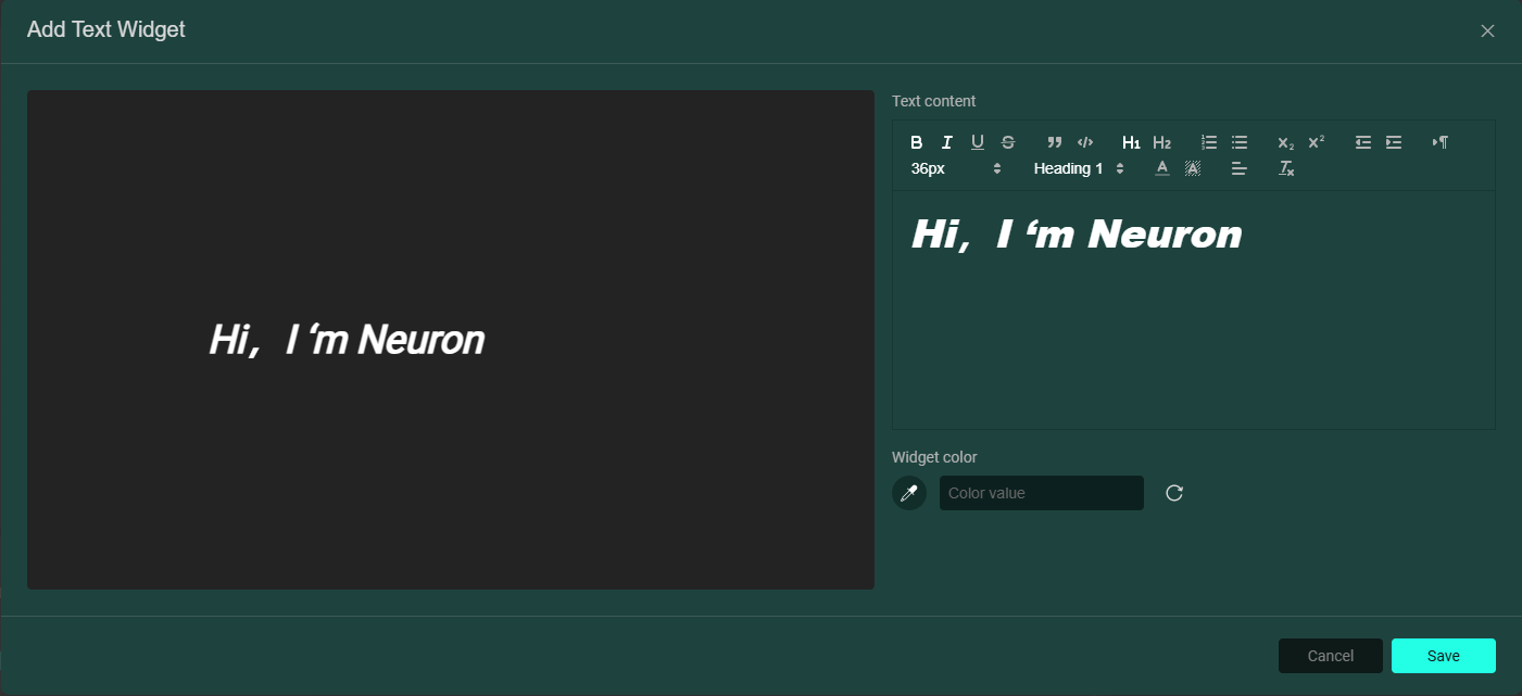
Text Card: Used to display text content;
-
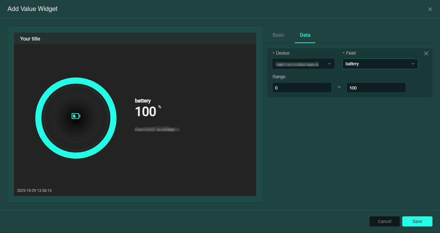
Value Card: Used to display device values. You can enter a title in the Basic section, select the value display style; add devices and their related fields in the Data section, as shown below:
-
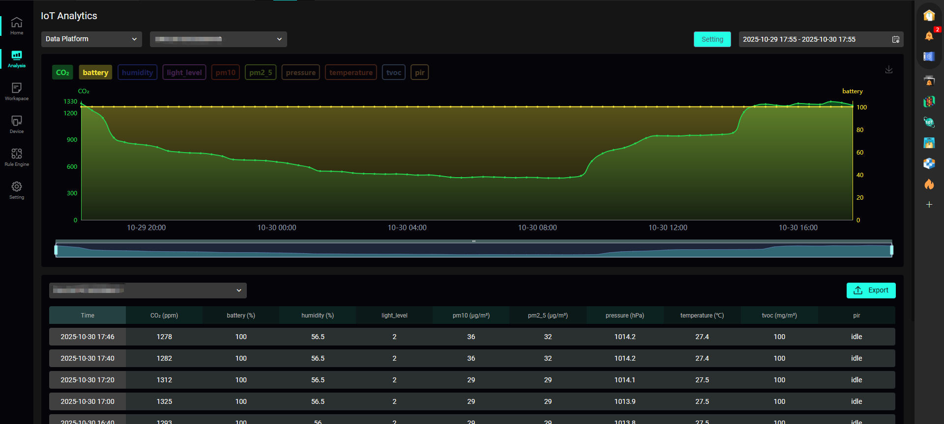
Chart Card: Displays device data in chart form. You can enter a title in the Basic section, select the chart display style, data time range (flexible/fixed time); add devices and their related fields in the Data section, and multiple device fields can be added, as shown below:

-
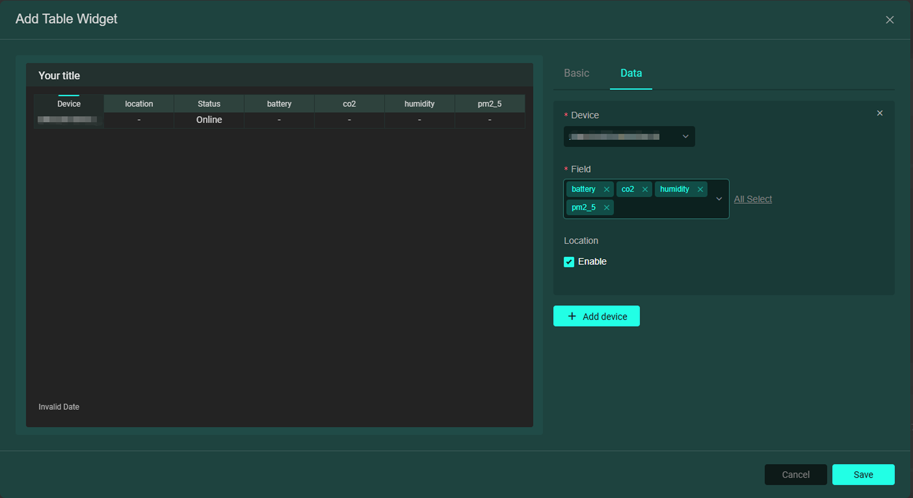
Table Card: Displays device data in table form. You can enter a title in the Basic section; add devices and their related fields in the Data section, and multiple device fields can be added. If Location is checked, the table will show the device's location, as shown below:
-
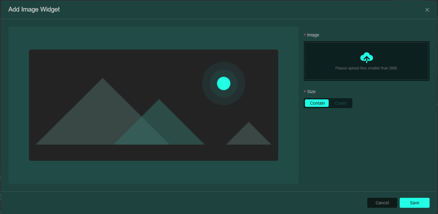
Image Card: Used to display image content;
-
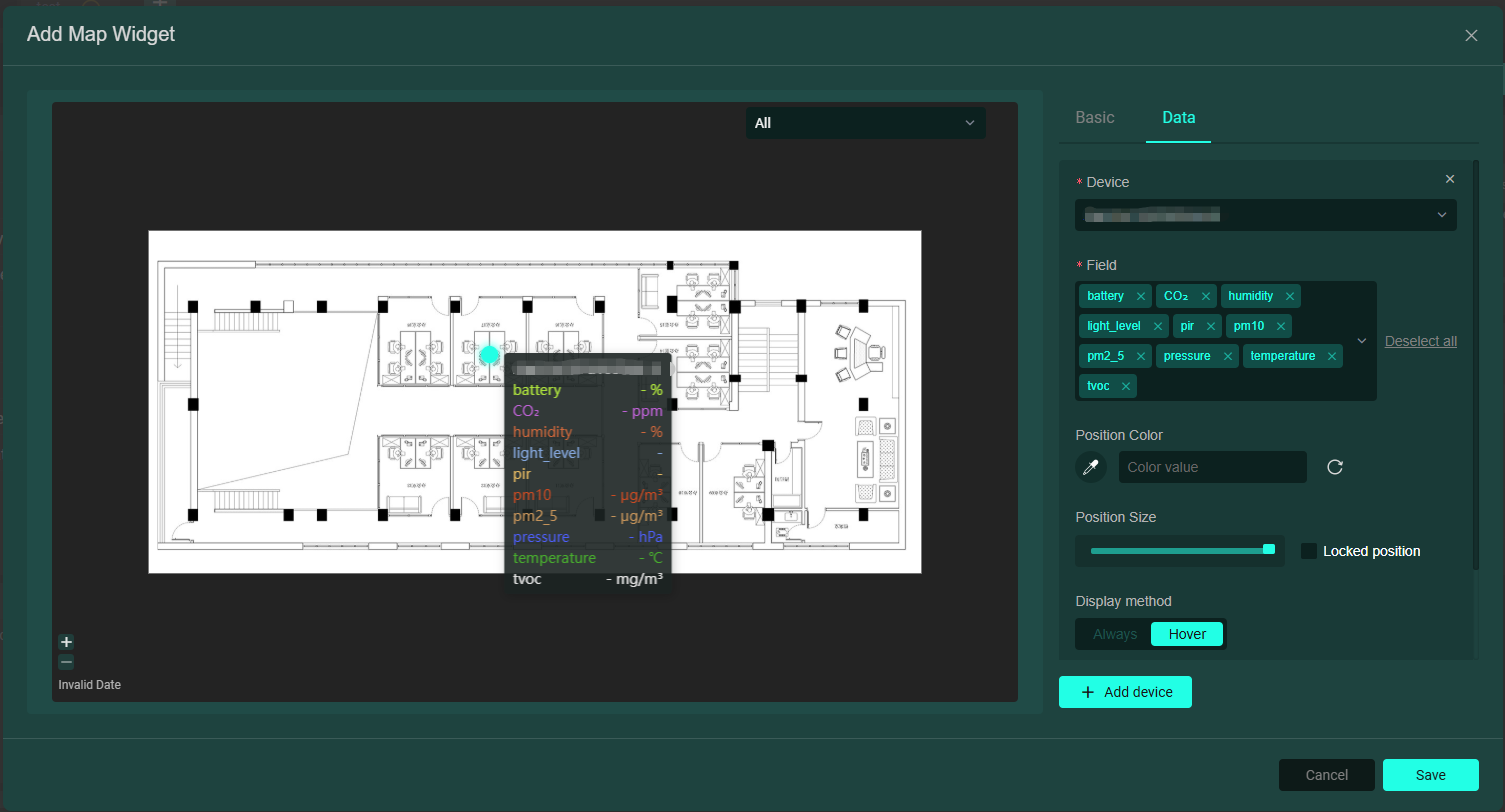
Map Card: You can upload an image (e.g., a location layout map) as the map, add devices and their related fields in the Data section to generate a dot for previewing device data (multiple devices can be uploaded, resulting in multiple dots), as shown below:
-
Alert Card: Used to display device values linked to the field's generic level. When a rule is configured for the device field's generic level and triggered, the card will change color and text, as shown below:
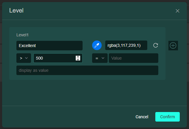
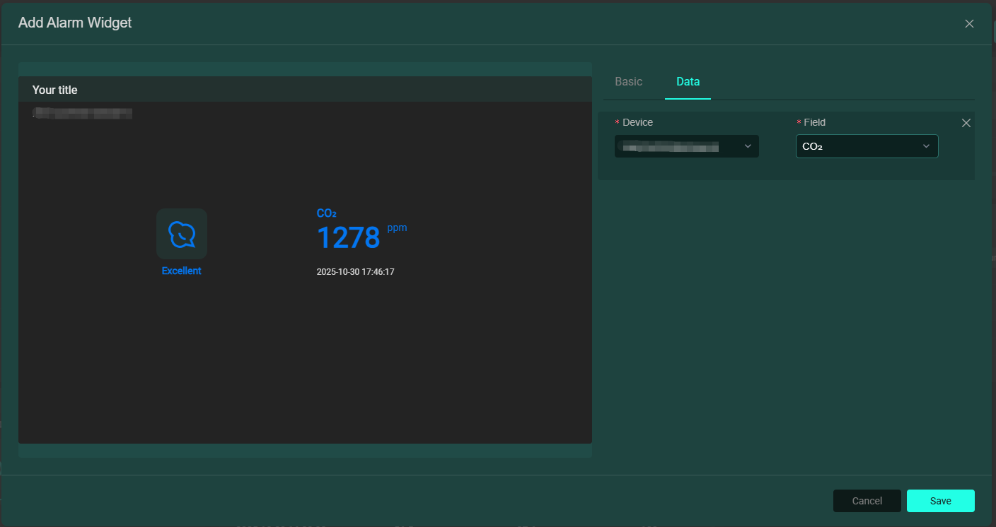 Field generic level configuration can be viewed in Device Field Management.
 -
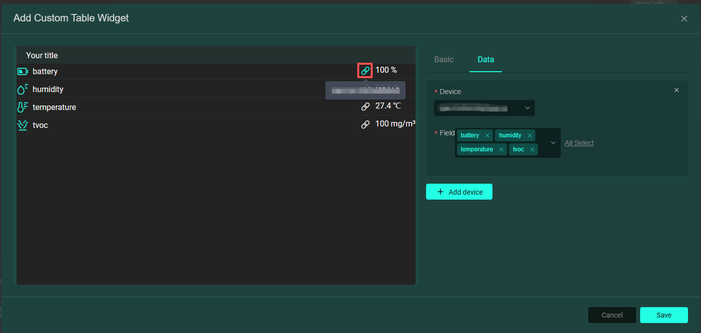
Custom Table Card (Detail Card): Used to display detailed device data. Generates a custom table by adding devices and their related fields from the Data section. Hover over the link button to view the device name, click to jump to the device's analysis interface, as shown below:
-
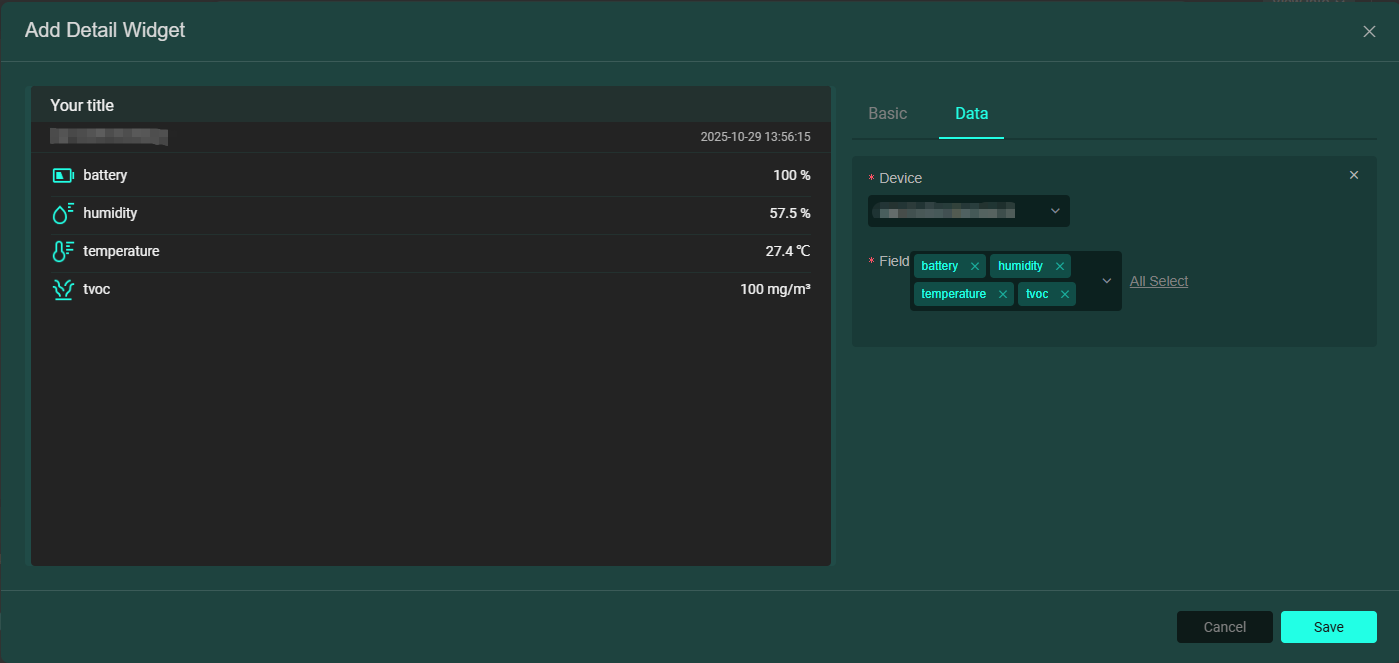
Detail Card: Used to display detailed device data. Generates a detailed table of device data by adding devices and their related fields from the Data section, as shown below:
-
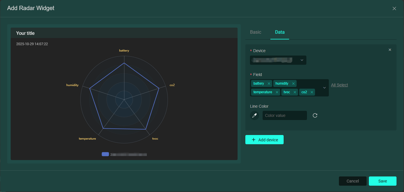
Radar Chart Card: Displays device data in a radar chart style. Multiple device fields can be added, as shown below:
-
Web Embed Card: Used to display a webpage. Simply embed the webpage link, as shown below:

-
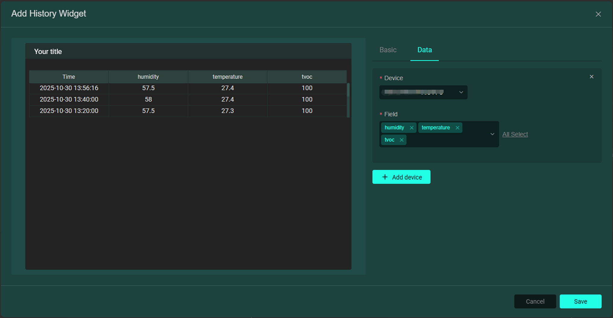
Historical Data Card: Used to display historical device data. In the Basic section, select the data format, data time range (flexible/fixed time), and whether to display the data time; in the Data section, add devices and their related fields, multiple device fields can be added, as shown below:
-
Control Card: Used to control devices that support reverse control (e.g., switches, electronic locks). Add devices and their related fields in the Data section. If the added device is not configured for reverse control, an error pop-up will appear as shown below:
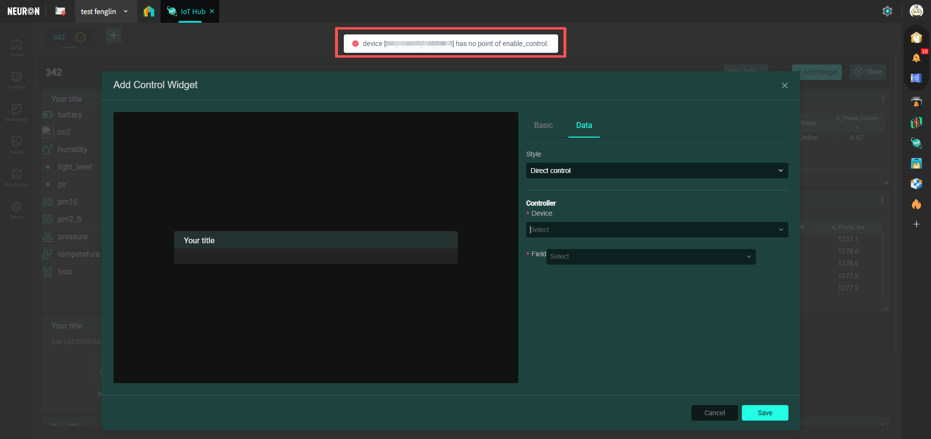 (If reverse control configuration is needed, please proceed to Device Reverse Control ).
 -
Special Chart Card: Displays device data in chart form. Different from 【3. Chart Card】, this chart is suitable for devices that have already been configured with secondary calculation. You can enter a title in the Basic section, select the chart display style, data time range (flexible/fixed time); add devices and their related fields in the Data section, and multiple device fields can be added, as shown below:
widget_data-45c82af5b9fad00e3d46e5fe6dc76328.png)
-
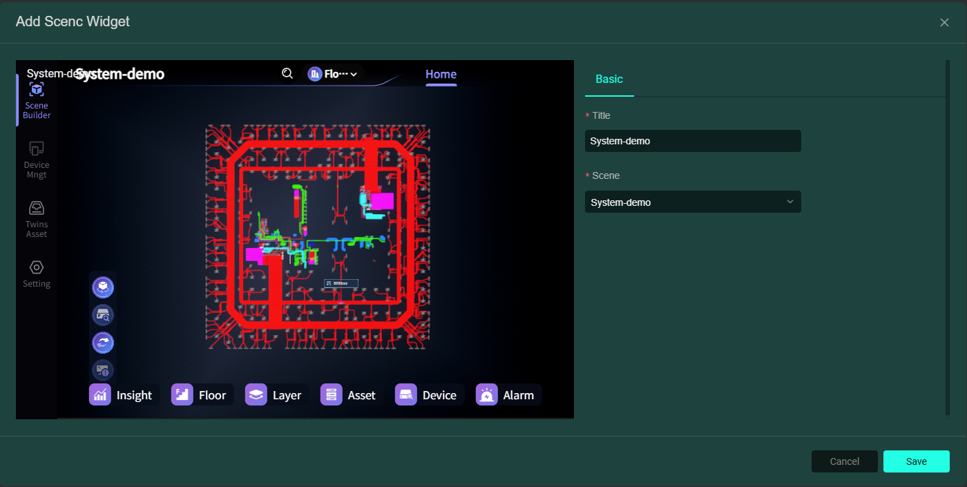
Digital Scene Card: Used to display scenes from digital twin applications. Select a published scene in the Scene section. As shown below:
-
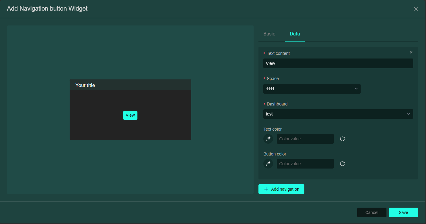
Navigation Card: Used to quickly jump from this dashboard to other space dashboards. Enter the navigation button text in the Data section, select any space and any dashboard under that space, as shown below:
Dashboard Templates
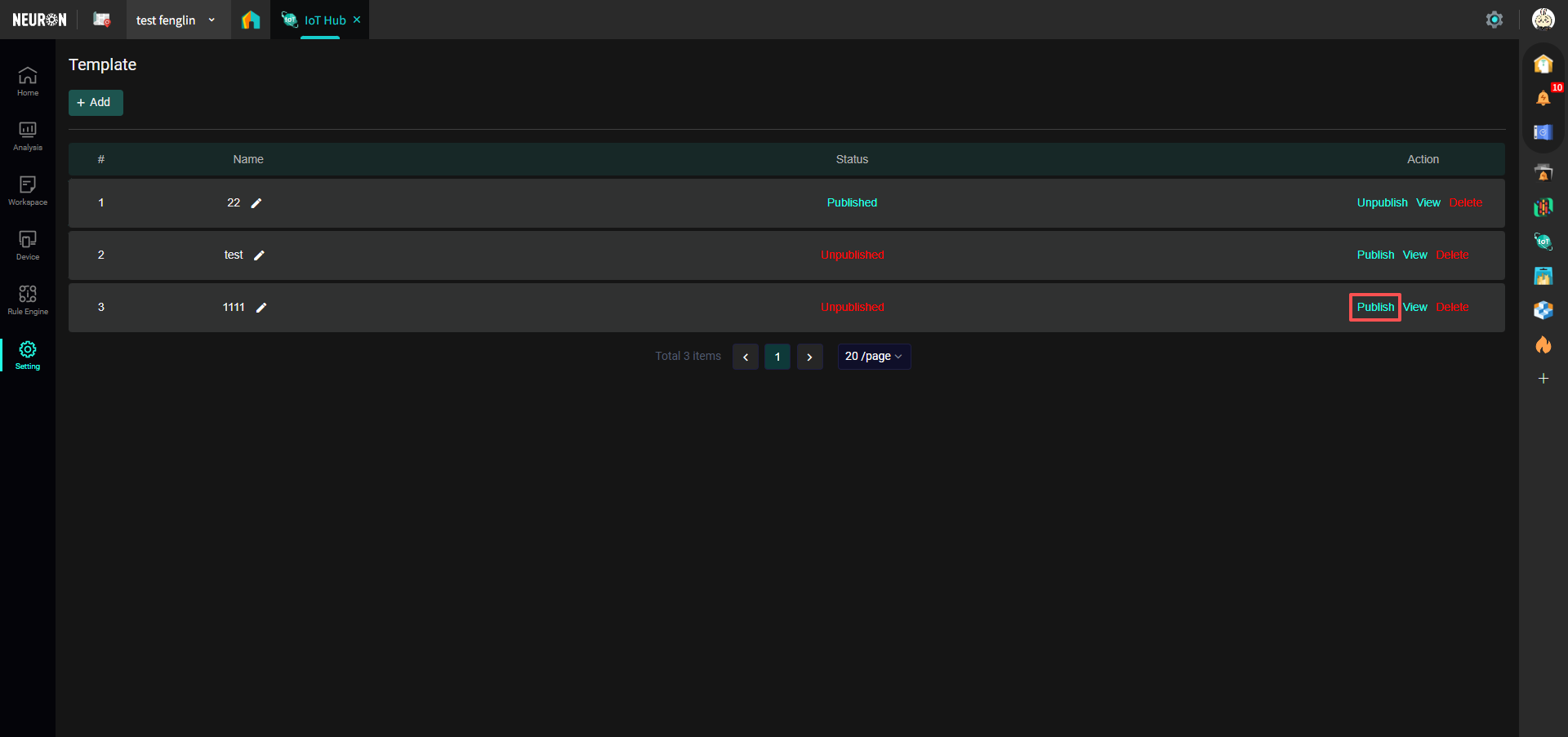
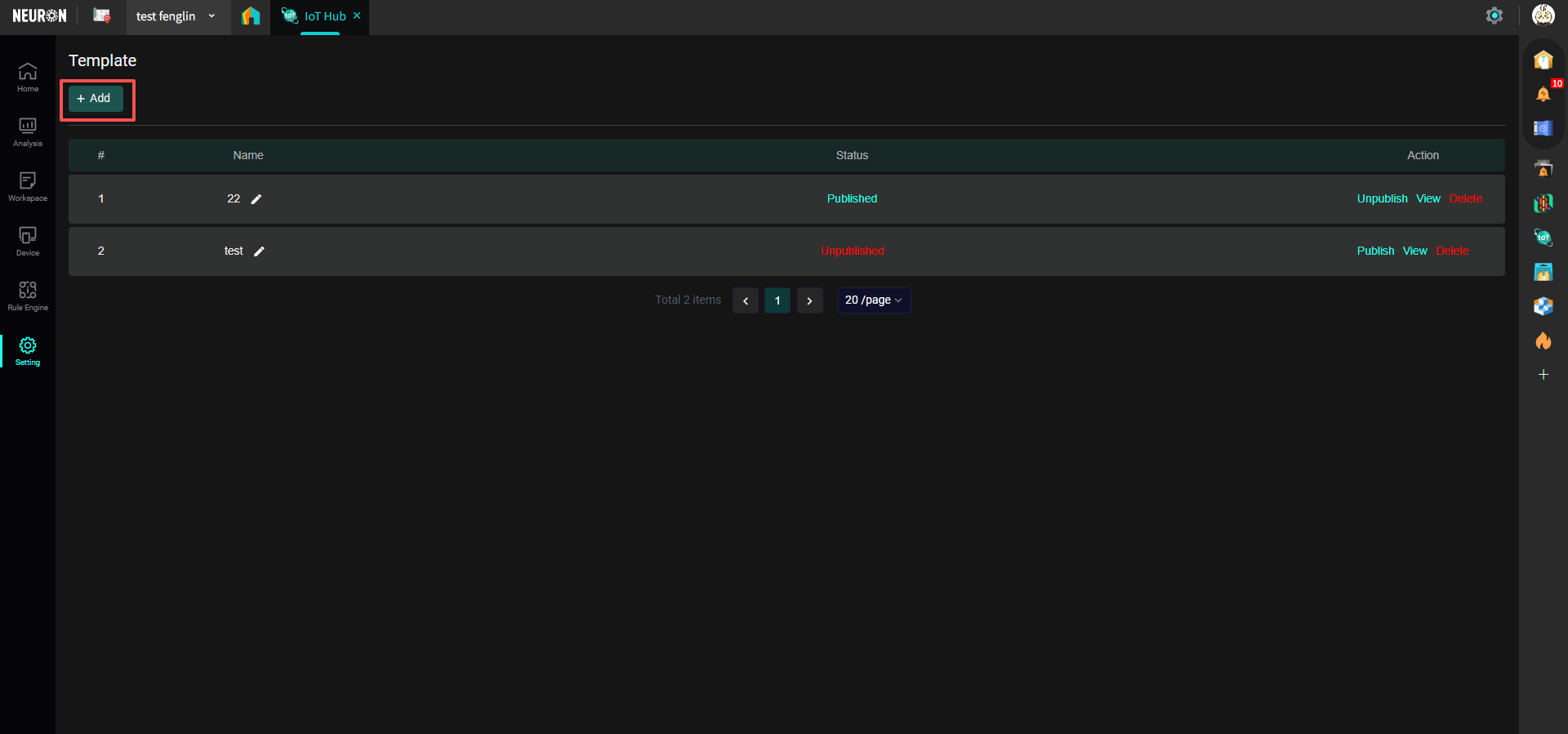
- Enter the Template page: Find "Settings" in the left menu bar, select "Templates", as shown below:

- Create a new template: Click the "Add" button, as shown below:
- Template Details page: After creating a new template, you will get a page similar to the dashboard page, as shown below:
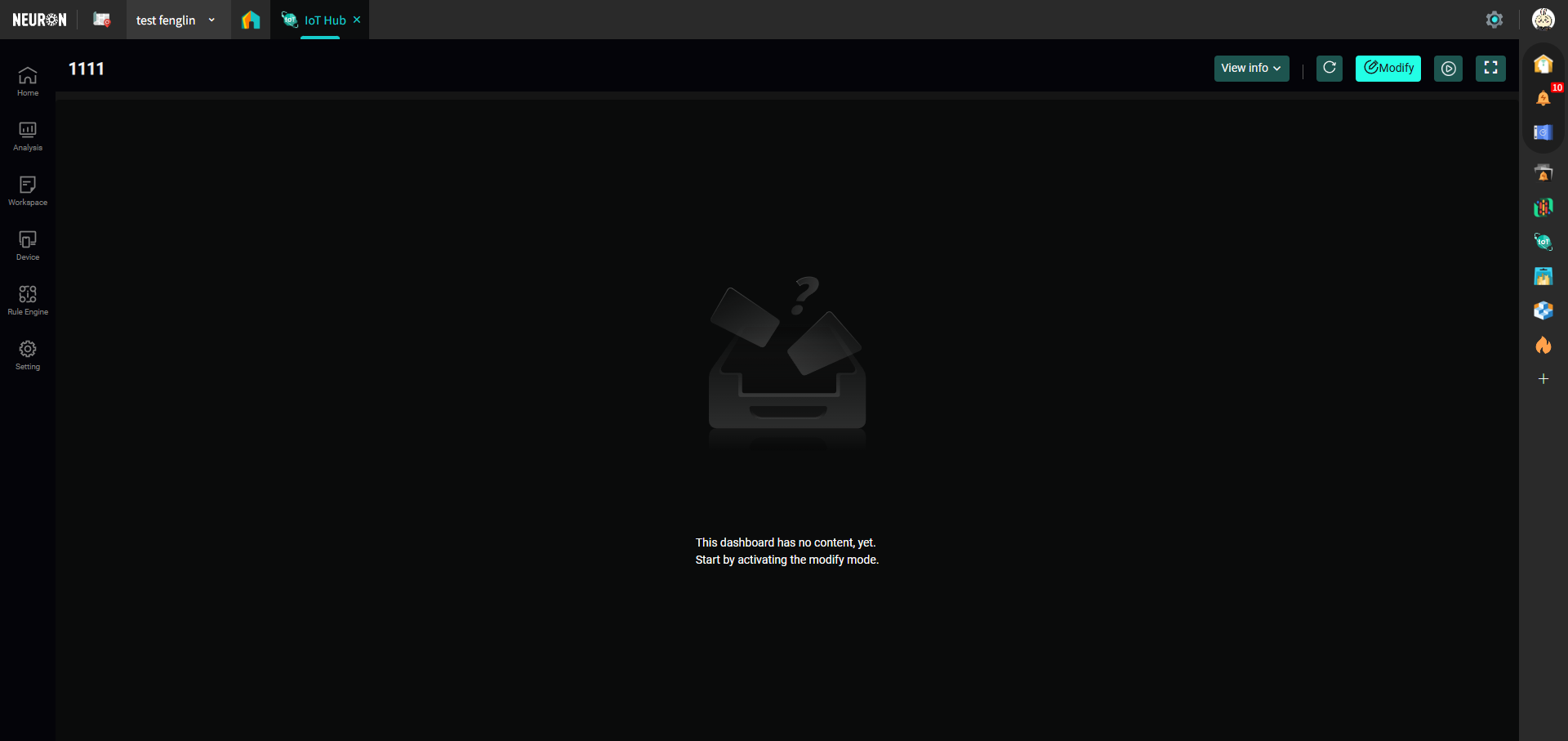 For the functional modules within the page, you can refer to the Dashboard Pages section above.
- Publish Template: You need to publish the template before you can use it when creating a new dashboard page; return to the Templates page, and select Publish Template next to the template you created, as shown below: